Work
About
Entain Navigation
Entain Navigation
Entain are the parent company of multiple sportsbook betting brands, including Bwin and SportingBet. The brands essentially live within the same codebase; the UX is fundamentally the same but the UI adapts.
Entain are the parent company of multiple sportsbook betting brands, including Bwin and SportingBet. The brands essentially live within the same codebase; the UX is fundamentally the same but the UI adapts.
It had been observed on many occasions by stakeholders, testing participants and product teams that the navigation was convoluted and confusing. My job: getting to the bottom of these problems then designing solutions.
It had been observed on many occasions by stakeholders, testing participants and product teams that the navigation was convoluted and confusing. My job: getting to the bottom of these problems then designing solutions.
What exactly are the current problems?
What exactly are the current problems?
What exactly are the current problems?
At first glance, there are many seemingly arbitrary inconsistencies within the product; I screen-shotted all the journeys within the sportsbook and set about annotating and evaluating the information architecture and navigational framework against usability heuristics (Nielsen’s heuristics are a good starting point but I also like to reference a paper written by James Helfrich called the ‘Variables of Usability’). In an ideal world, this exercise would be done with multiple people as I don’t fundamentally believe that I alone am competent enough to notice every issue; however, we were short on personnel so this was a solo mission.
At first glance, there are many seemingly arbitrary inconsistencies within the product; I screen-shotted all the journeys within the sportsbook and set about annotating and evaluating the information architecture and navigational framework against usability heuristics (Nielsen’s heuristics are a good starting point but I also like to reference a paper written by James Helfrich called the ‘Variables of Usability’). In an ideal world, this exercise would be done with multiple people as I don’t fundamentally believe that I alone am competent enough to notice every issue; however, we were short on personnel so this was a solo mission.

With issues related to usability heuristics documented from an individual point of view, the next information I wanted was hard data - in the form of tracking. I spoke with the data analytics team and we were able to start painting a picture of which areas of the product were seeing substantial traffic.
With issues related to usability heuristics documented from an individual point of view, the next information I wanted was hard data - in the form of tracking. I spoke with the data analytics team and we were able to start painting a picture of which areas of the product were seeing substantial traffic.

The data that we looked into was far more substantial than this but I feel that I’d bore even the most enthusiastic data professionals by including all of it...
The data that we looked into was far more substantial than this but I feel that I’d bore even the most enthusiastic data professionals by including all of it...
Ensuring I had all journeys covered
Ensuring I had all journeys covered
I created a sitemap to ensure I hadn’t missed anything.
I created a sitemap to ensure I hadn’t missed anything.

Learning from the users
Learning from the users
I wanted to observe users in action so I created a list of tasks within the Bwin sportsbook. These tasks were decided upon by documenting all the interfaces and their variants - i.e. the football main page as opposed to the tennis main page - that a user could reach within the sportsbook. The order of tasks to navigate from one interface to the next were then randomised for each participant; there were a total of 12 tasks.
The test featured 23 participants - why? Whilst the common 5 usability tests - popularised by Jakob Nielsen - are sometimes enough, research also shows that if you have the time and resource you can often find more issues by conducting more tests.

One of the lucky test participants in action (above).
One of the lucky test participants in action (above).
I documented which key journeys were fundamentally flawed and where the users were struggling the most. It turned out there were several problems.
I documented which key journeys were fundamentally flawed and where the users were struggling the most. It turned out there were several problems.

Could I learn anything from elsewhere?
Could I learn anything from elsewhere?
To complement the user-focused discovery, I also looked into many examples of intuitive, simple navigation from outside the sports betting industry; Entain has had a long-lasting problem with simply copying competitors. These included Spotify, Netflix and Instagram among others.
To complement the user-focused discovery, I also looked into many examples of intuitive, simple navigation from outside the sports betting industry; Entain has had a long-lasting problem with simply copying competitors. These included Spotify, Netflix and Instagram among others.
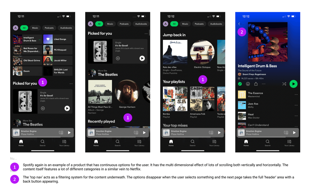
Patterns emerged. I won’t list them all here but here are a few major takeaways:
Lazy loading when scrolling, negating the need for complex navigational systems.
Oftentimes, less is more
Once a user lands on a logical ‘end point’ of their journey the interface often loses superfluous features that were present at the start of the journey
Navigating ‘in and out’ or back and forth was normally doable in 2 to 3 steps maximum
So I decided to explore
So I decided to explore
Armed with a significant body of discovery work I was excited to start exploring. I split this into functional/mechanical ideas vs information architecture concepts.
Armed with a significant body of discovery work I was excited to start exploring. I split this into functional/mechanical ideas vs information architecture concepts.

Scrolling functionality (above) was an example of the former category, whereas breaking down the pills/tabs for the navigation was an IA exercise.
Scrolling functionality (above) was an example of the former category, whereas breaking down the pills/tabs for the navigation was an IA exercise.

The next stage of the project saw these ideas being tested. After much deliberation, I decided to create two main prototypes with two fundamentally different navigational mechanisms. I wanted to compare how intuitive they were.
The next stage of the project saw these ideas being tested. After much deliberation, I decided to create two main prototypes with two fundamentally different navigational mechanisms. I wanted to compare how intuitive they were.
The first leaned on a more traditional sportsbook style navigation, although there were some major changes to the speed at which users could dip in and out of interfaces with the integration of more overlays and a home button in the bottom left.
The first leaned on a more traditional sportsbook style navigation, although there were some major changes to the speed at which users could dip in and out of interfaces with the integration of more overlays and a home button in the bottom left.
The second was inspired by a contextual pill style filtering system - used in products such as Spotify and Google Search. The theory behind this was that it would allow an even more seamless resetting of the user’s journey, allowing them to navigate in one singular, condensed area.
The second was inspired by a contextual pill style filtering system - used in products such as Spotify and Google Search. The theory behind this was that it would allow an even more seamless resetting of the user’s journey, allowing them to navigate in one singular, condensed area.
To continue learning about the progress of this project please get in touch - from this stage onwards this information is protected.
To continue learning about the progress of this project please get in touch - from this stage onwards this information is protected.
Check out some of my other projects below:
Check out some of my other projects below:
