
Axis Workshops
Axis Workshops

Axis Workshops was a product aimed to create engaging, inclusive workshops for companies that practiced brainstorming and ideation sessions. The CTO explained that ‘there’s always someone in the room who talks too much, whilst someone quieter is sat there with excellent opinions but never gets a chance to express them’ - Axis wanted to bridge this gap and give equal opportunity to all.
Axis Workshops was a product aimed to create engaging, inclusive workshops for companies that practiced brainstorming and ideation sessions. The CTO explained that ‘there’s always someone in the room who talks too much, whilst someone quieter is sat there with excellent opinions but never gets a chance to express them’ - Axis wanted to bridge this gap and give equal opportunity to all.
This was a 3-week design sprint. The brief changed over the course of the project: at first, our aim was simply to make the platform more intuitive, but after further discussions Axis decided to focus on redesigning the platform themselves, whilst we worked solely on the registration process.
However, after tackling this for a week, users stated that our registration designs were intuitive and easy to use, so we were given the green light to design more of the platform.
First steps
First steps
We had a call with the product designer and CTO of the Axis team to get a better feel for the difficulties they had been facing. They explained that the registration was something that users were not interacting with well: after seeing the data we could see that 65% of users failed to complete it.
We had a call with the product designer and CTO of the Axis team to get a better feel for the difficulties they had been facing. They explained that the registration was something that users were not interacting with well: after seeing the data we could see that 65% of users failed to complete it.
User feedback
User feedback
Realistically, usability tests were required to gain real insights into why the registration was perhaps falling short. After testing on 8 users, the frustration centred around it taking too long; users felt they were inputting unnecessary information. One particular user stated:
Realistically, usability tests were required to gain real insights into why the registration was perhaps falling short. After testing on 8 users, the frustration centred around it taking too long; users felt they were inputting unnecessary information. One particular user stated:
“you have to do lots of work for them before they have anything to offer you”.
“you have to do lots of work for them before they have anything to offer you”.
Whilst this was very useful, we felt that we needed some further insights from people who hadn't used the Axis product. We created a survey. 150 people responded, with 97% stating that they expected to complete a registration process in under 2 minutes. In addition, 68% of participants cited ‘inputting unnecessary information’ as their main reason for frustration during a registration process. Participants also overwhelmingly stated that being able to sign up with Google was a preference.
Whilst this was very useful, we felt that we needed some further insights from people who hadn't used the Axis product. We created a survey. 150 people responded, with 97% stating that they expected to complete a registration process in under 2 minutes. In addition, 68% of participants cited ‘inputting unnecessary information’ as their main reason for frustration during a registration process. Participants also overwhelmingly stated that being able to sign up with Google was a preference.
Sketching ideas and iterating
Sketching ideas and iterating

As users reported that this generally made sense we were able to move into mid-fidelity. We tested the mid-fi version on 6 users. The next issue arose once they had clicked ‘sign up’ they were taken to an email verification page. One user immediately made a helpful suggestion to add the option of a ‘shortcut’ selection of email providers.
As users reported that this generally made sense we were able to move into mid-fidelity. We tested the mid-fi version on 6 users. The next issue arose once they had clicked ‘sign up’ they were taken to an email verification page. One user immediately made a helpful suggestion to add the option of a ‘shortcut’ selection of email providers.

New direction
New direction
After the high fidelity designs went down well with a new set of users, we spoke to the client and stated that we felt we had largely solved the problems that we had identified. We therefore agreed to broaden our scope. By this stage we were more pressed for time, however we were still able to conduct 8 further usability tests in order to understand pain points outside of the registration process.
After the high fidelity designs went down well with a new set of users, we spoke to the client and stated that we felt we had largely solved the problems that we had identified. We therefore agreed to broaden our scope. By this stage we were more pressed for time, however we were still able to conduct 8 further usability tests in order to understand pain points outside of the registration process.
The key findings from these centred largely around terminology and navigation. Users found the current designs somewhat unintuitive because they didn’t understand the language on the page, they were unsure of where exactly to look, and what exactly to interact with. Indeed, this was evident in one user’s struggle:
The key findings from these centred largely around terminology and navigation. Users found the current designs somewhat unintuitive because they didn’t understand the language on the page, they were unsure of where exactly to look, and what exactly to interact with. Indeed, this was evident in one user’s struggle:
“This page is very overwhelming, I’m not too sure where I’m supposed to be looking”
“This page is very overwhelming, I’m not too sure where I’m supposed to be looking”
The issue was split between the homepage and the landing page. We began by analysing the homepage, then moved onto the landing page after.
The issue was split between the homepage and the landing page. We began by analysing the homepage, then moved onto the landing page after.
Home page focus
Home page focus
Being the first page a user observes when they visit the site, it's imperative that this page has good UX.
Being the first page a user observes when they visit the site, it's imperative that this page has good UX.
We tested it with 12 people. Users were generally confused by what exactly the value proposition was, so one immediate conclusion was that we needed to simplify and demonstrate what Axis have to offer. Users also found the navigation somewhat difficult.
We tested it with 12 people. Users were generally confused by what exactly the value proposition was, so one immediate conclusion was that we needed to simplify and demonstrate what Axis have to offer. Users also found the navigation somewhat difficult.
"where do I log in?"
"where do I log in?"

After several iterations and myriad tests, we were informed that 'sign in' and 'sign up' was the clearest option.
After several iterations and myriad tests, we were informed that 'sign in' and 'sign up' was the clearest option.
We had been told that the mission was to create an experience that let everyone be heard, whilst the user feedback was that the terminology on the homepage was confusing, so we amended the wording on the top of the page. 5 users also mentioned that their current homepage video doesn't showcase what the product actually does, so we implemented a run through of the product to clarify the MVP.
We had been told that the mission was to create an experience that let everyone be heard, whilst the user feedback was that the terminology on the homepage was confusing, so we amended the wording on the top of the page. 5 users also mentioned that their current homepage video doesn't showcase what the product actually does, so we implemented a run through of the product to clarify the MVP.

Landing page focus
Landing page focus
As previously stated, once users had suggested that they were content with our designs on the homepage, the logical next step was working on the landing page.
As previously stated, once users had suggested that they were content with our designs on the homepage, the logical next step was working on the landing page.
This was the most difficult part of the project as users repeatedly stated that they did not understand where they were or what they were supposed to do.
This was the most difficult part of the project as users repeatedly stated that they did not understand where they were or what they were supposed to do.
We attempted to create a dashboard which would simplify the product. By inserting a side navigation, we thought that users would better understand where they were. Within the navigation, we wanted to help users create workshop templates.
We attempted to create a dashboard which would simplify the product. By inserting a side navigation, we thought that users would better understand where they were. Within the navigation, we wanted to help users create workshop templates.

This was all well and good, but despite the navigation being clearer, 12 users claimed that they simply did not know what the product was offering them. Our solution was a 'soft' onboarding - users would be taken through the product step by step.
This was all well and good, but despite the navigation being clearer, 12 users claimed that they simply did not know what the product was offering them. Our solution was a 'soft' onboarding - users would be taken through the product step by step.
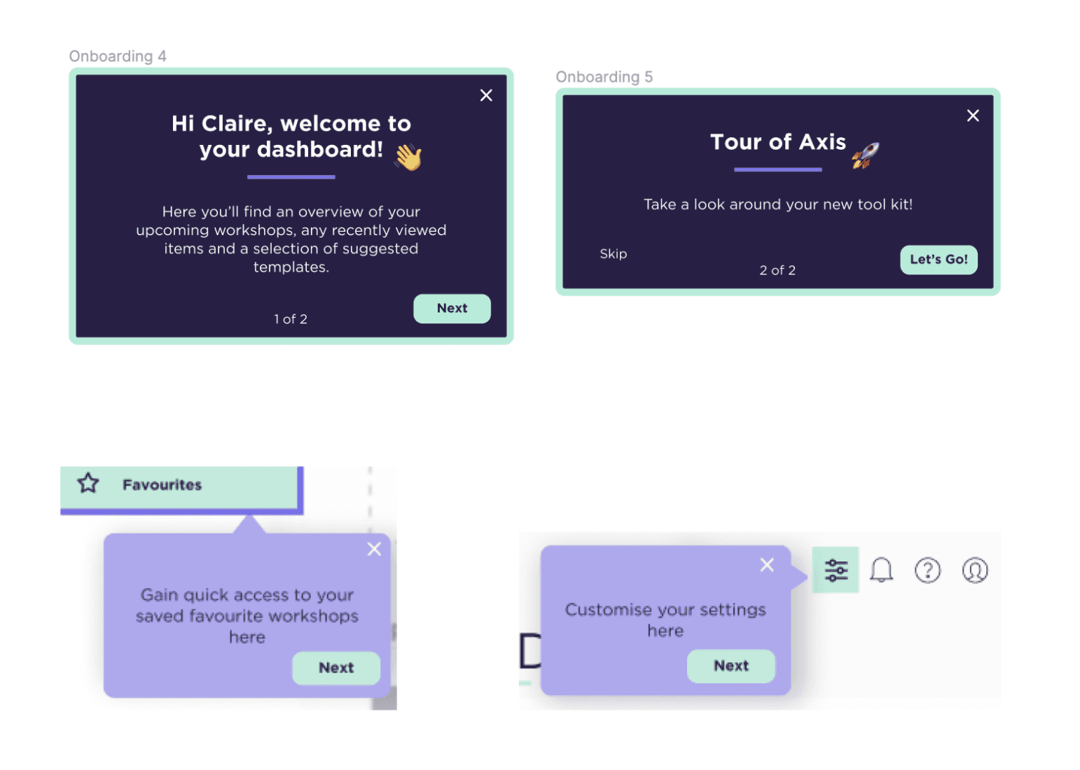
Once we'd tested this, we were delighted to see that users were starting to understand more. Below is the final version of the dashboard:
Once we'd tested this, we were delighted to see that users were starting to understand more. Below is the final version of the dashboard:

To conclude
To conclude
This was the end of the sprint. Ultimately, we didn’t have control over which designs made it to development due to our position as contractors rather than full members of the Axis team. I can only say from my experience it was a valuable lesson in stakeholder management and diplomacy - something I have carried with me.
This was the end of the sprint. Ultimately, we didn’t have control over which designs made it to development due to our position as contractors rather than full members of the Axis team. I can only say from my experience it was a valuable lesson in stakeholder management and diplomacy - something I have carried with me.
Check out some of my other projects below:
Check out some of my other projects below:
Work
About